
How Web Developers Are Preparing for Foldable iOS Devices With Video.js v10 and New Web APIs

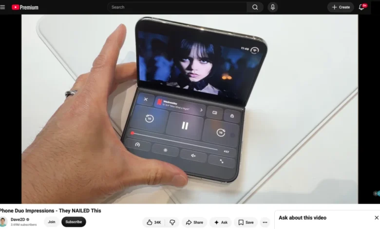
The landscape of mobile web development is undergoing a fundamental shift as hardware ecosystems evolve to embrace multi-screen and foldable form factors. Following the release of Video.js version 10.0.0, developers have begun actively exploring how modern web APIs can interact with cutting-edge mobile hardware. While foldable devices have maintained a steady presence in the Android ecosystem for several years, recent developer documentation and SDK releases from Apple point toward an impending expansion of foldable iOS hardware. This convergence of new hardware paradigms and web standards has sparked significant interest within the frontend engineering community regarding layout responsiveness, device posture awareness, and advanced media playback interfaces.
Background Context of the Foldable Hardware Evolution
Foldable mobile devices initially entered the consumer market via Android manufacturers, gradually refining their hinge mechanisms, software split-screen capabilities, and UI adaptations. Historically, iOS developers and web engineers operating within the Apple ecosystem have been restricted to traditional, single-screen rectangular viewports, with the primary layout variations limited to standard phone dimensions and iPad tablet form factors.
However, recent technical releases from major platform holders indicate a pivot toward foldable integration within iOS. Apple’s release of specialized developer resources, including comprehensive video walkthroughs and architectural guidelines for upcoming folding hardware, signals that multi-screen interactions will soon become a standard consideration for mobile software engineering. These resources highlight how physical device states—such as an open continuous display versus a partially folded configuration akin to a miniature laptop—can be leveraged to deliver context-aware user experiences.
The Technical Foundation: Device Posture and Viewport Segments APIs
To build applications that adapt fluidly to folding displays, web developers rely on standardized Web APIs designed to communicate physical hardware changes to the browser rendering engine. Two primary standards stand at the center of this capability: the Device Posture API and the Viewport Segments API.
The Device Posture API provides programmatic access to whether a device’s display is continuous or folded. In a traditional smartphone or tablet, the posture is categorized as continuous. In a folding device that is bent at an angle, the posture shifts to folded. Developers can query this state directly in JavaScript via the navigator.devicePosture property or apply conditional styling using CSS media queries such as @media (device-posture: folded).
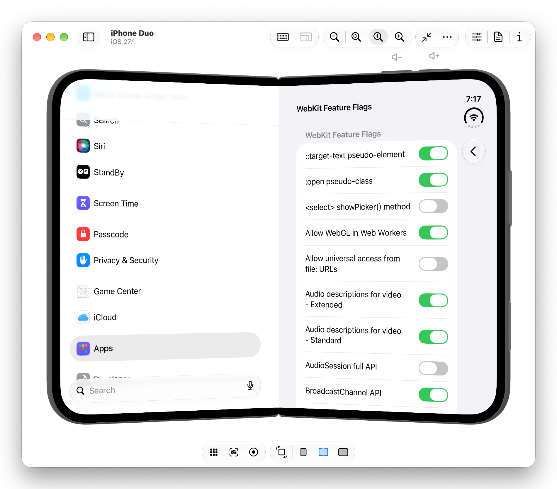
Complementing this is the Viewport Segments API, which divides multi-screen or folded viewports into distinct geometric regions. Through JavaScript, window.viewport.segments returns an array of DOMRect objects detailing the precise dimensions, coordinates, and boundaries of each segment. In CSS, developers can utilize environment variables alongside specific media queries—such as @media (horizontal-viewport-segments: n)—to snap layout grids precisely to individual screens. This mechanism prevents content from spilling into the unusable physical crease or hinge area of the device, enabling sophisticated two-column or split-pane interfaces that mimic native application design.
Implementation Challenges and Media Player Adaptations
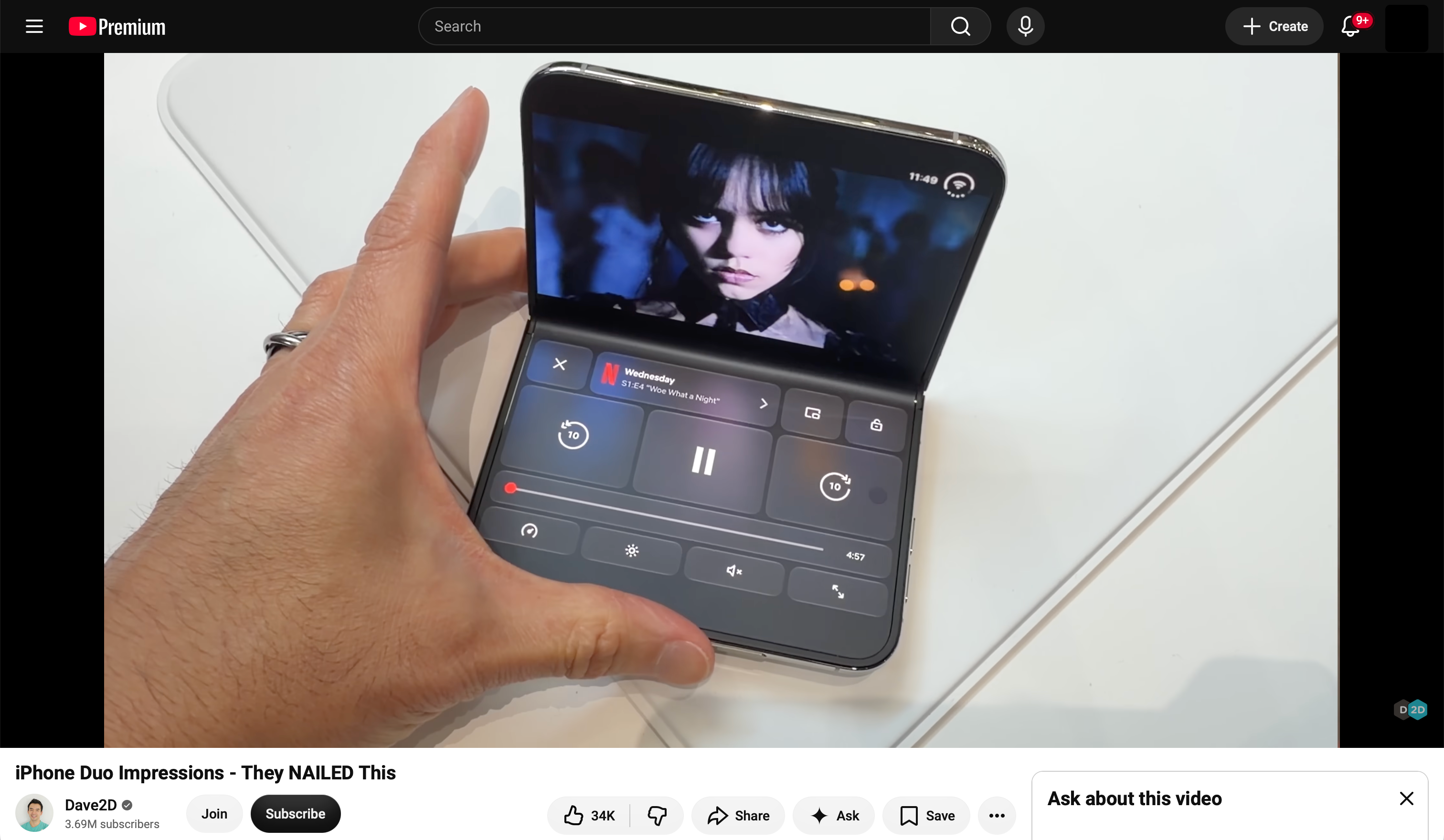
The practical implementation of these APIs presents unique engineering challenges, particularly for complex media playback components like Video.js. Multimedia delivery on mobile web browsers has historically faced strict platform limitations, especially concerning full-screen rendering and native control overlays.
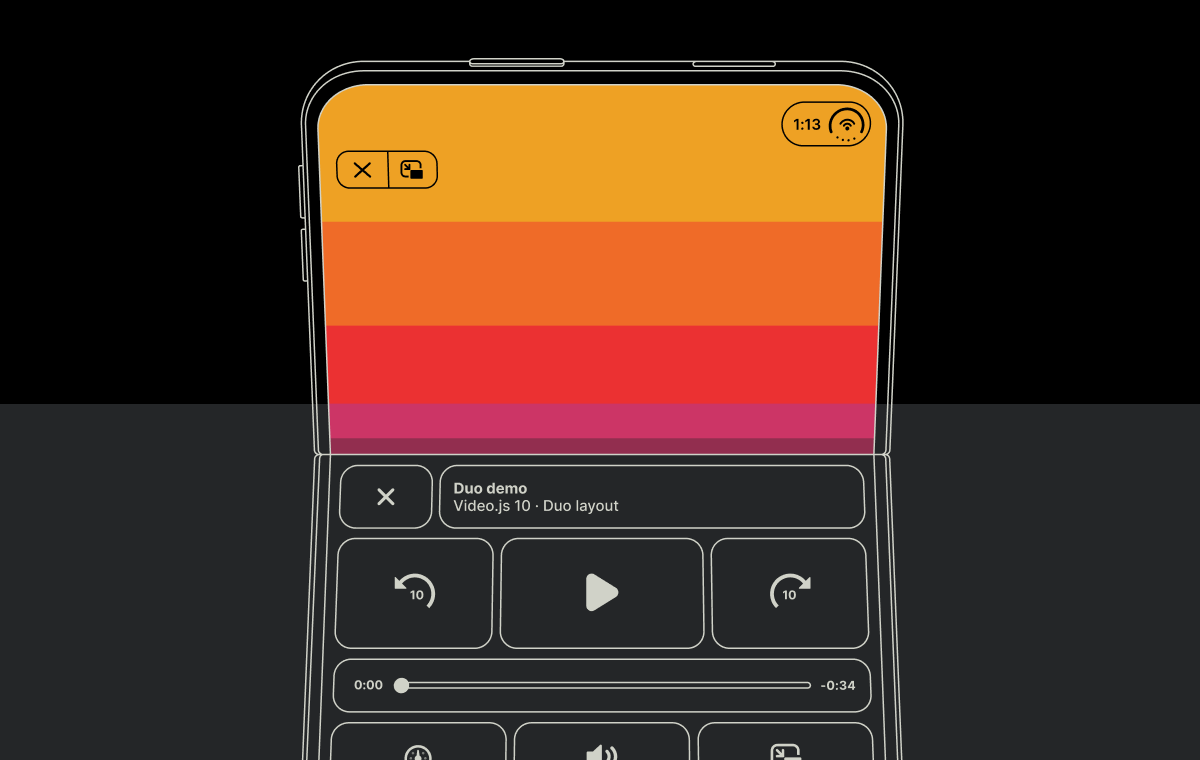
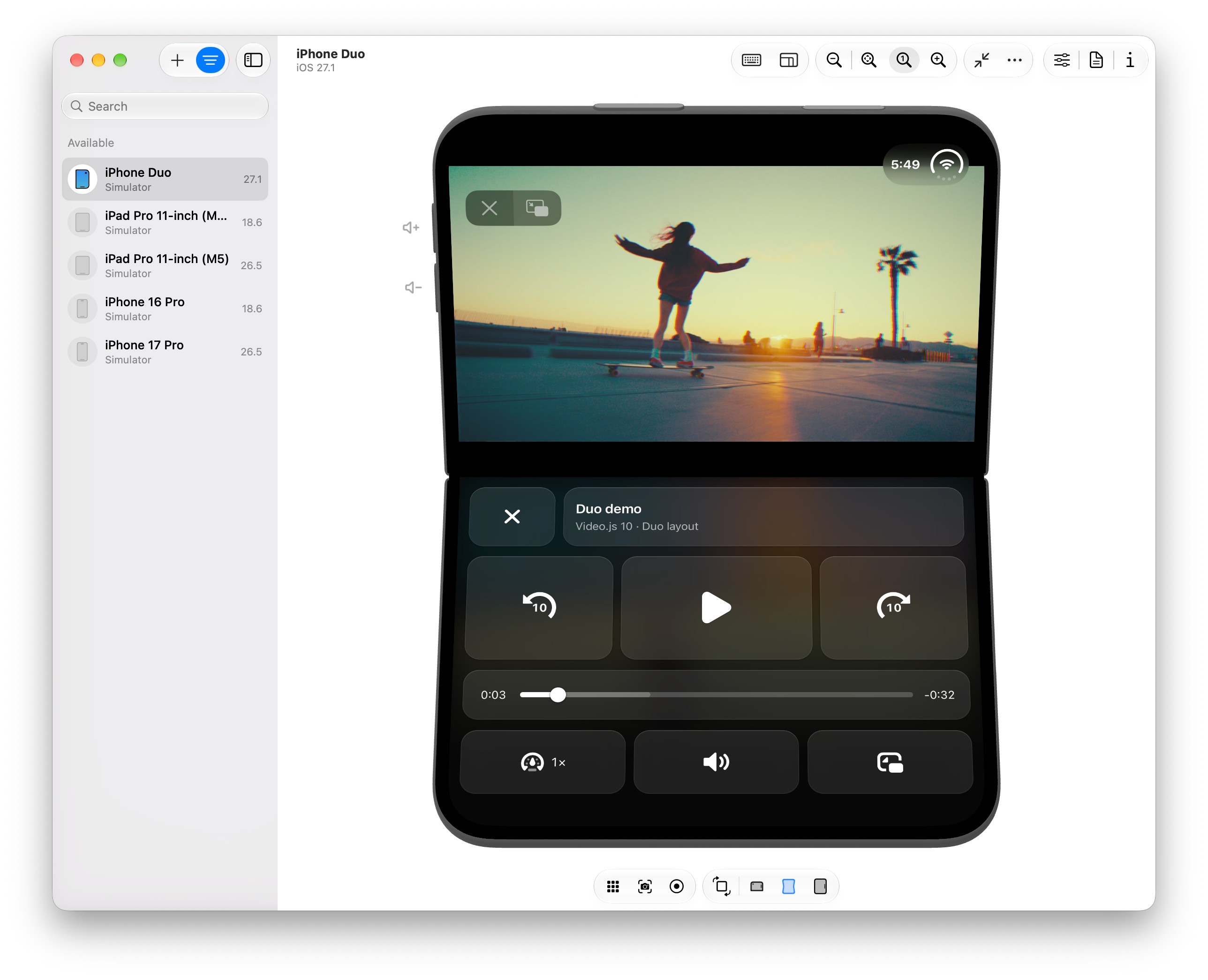
When analyzing how native applications handle media on folding displays—such as positioning the video stream on the upper half of the screen while rendering interactive controls and ambient lighting effects on the lower half—developers naturally seek to replicate these patterns on the web. Standard browser behavior, however, frequently restricts custom HTML elements from occupying full-screen states across segmented viewports without relying on experimental or restricted browser flags.
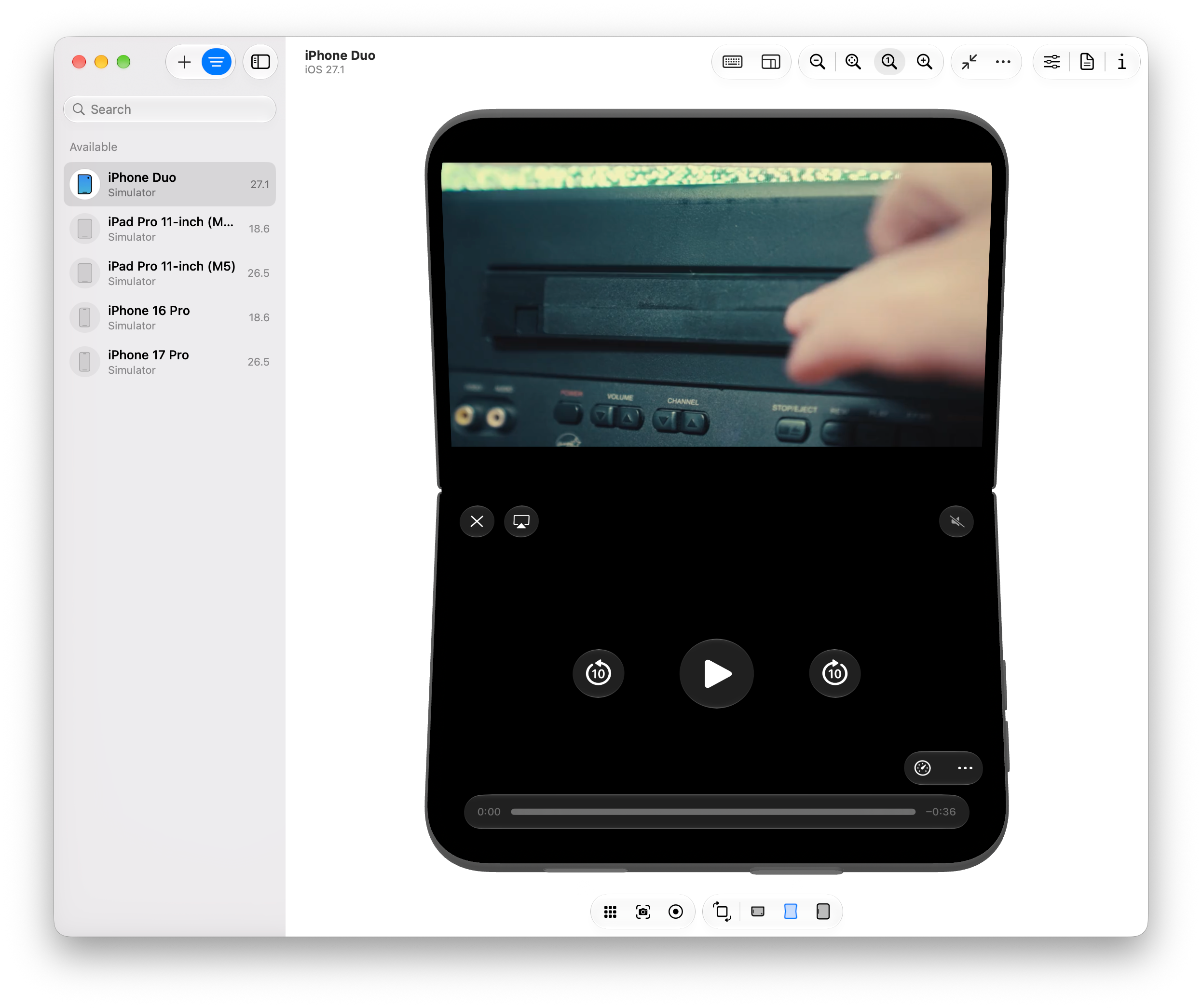
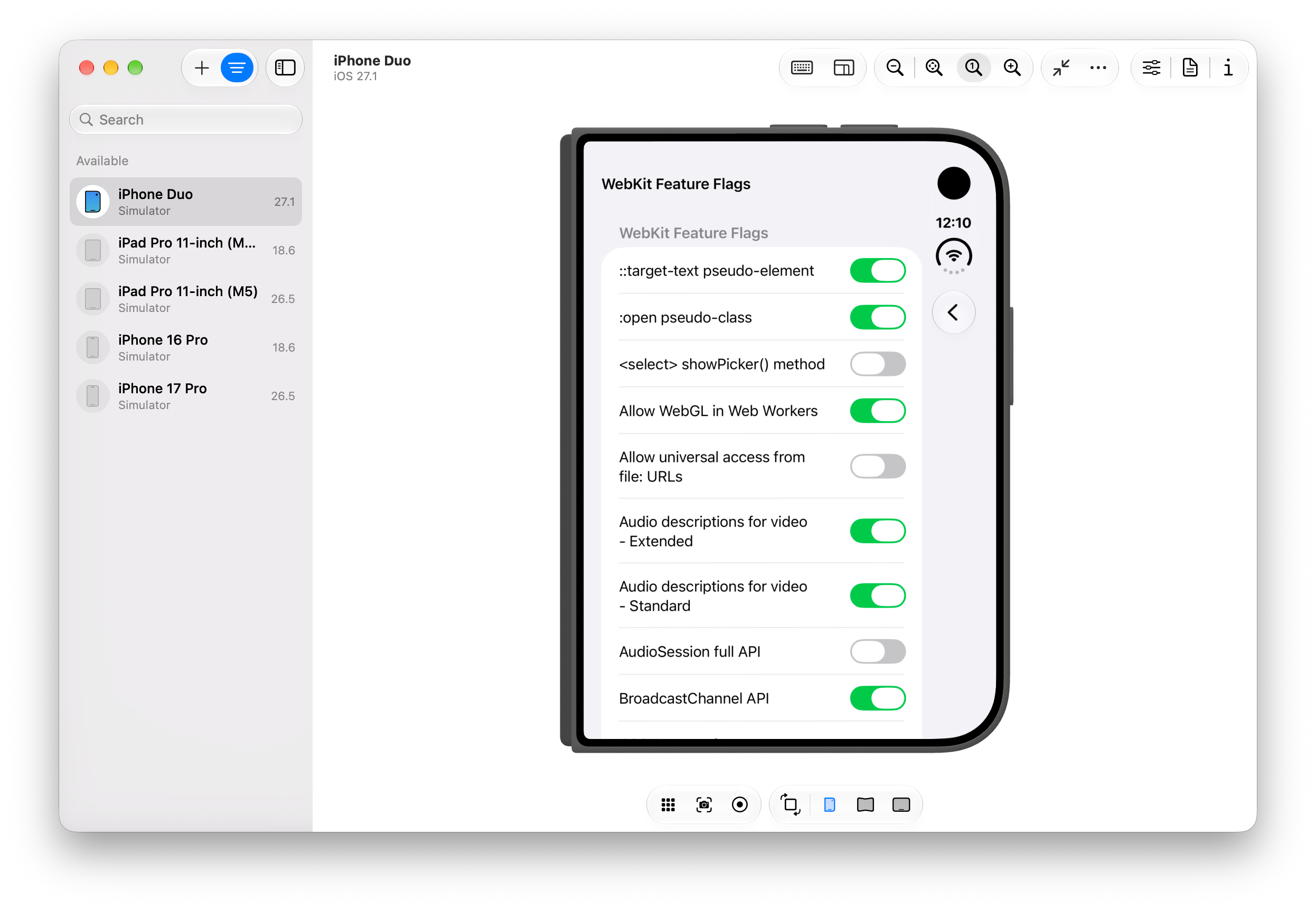
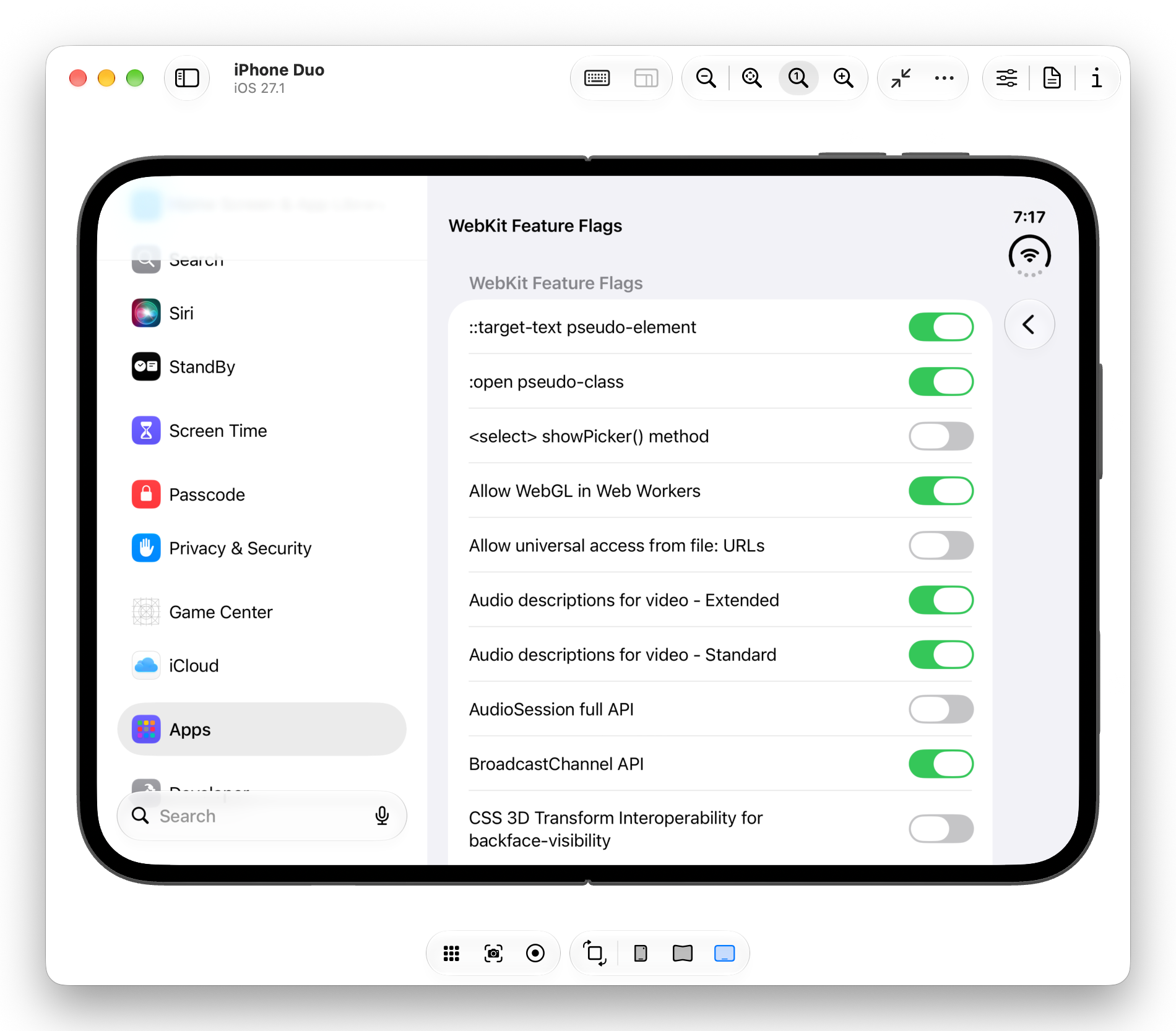
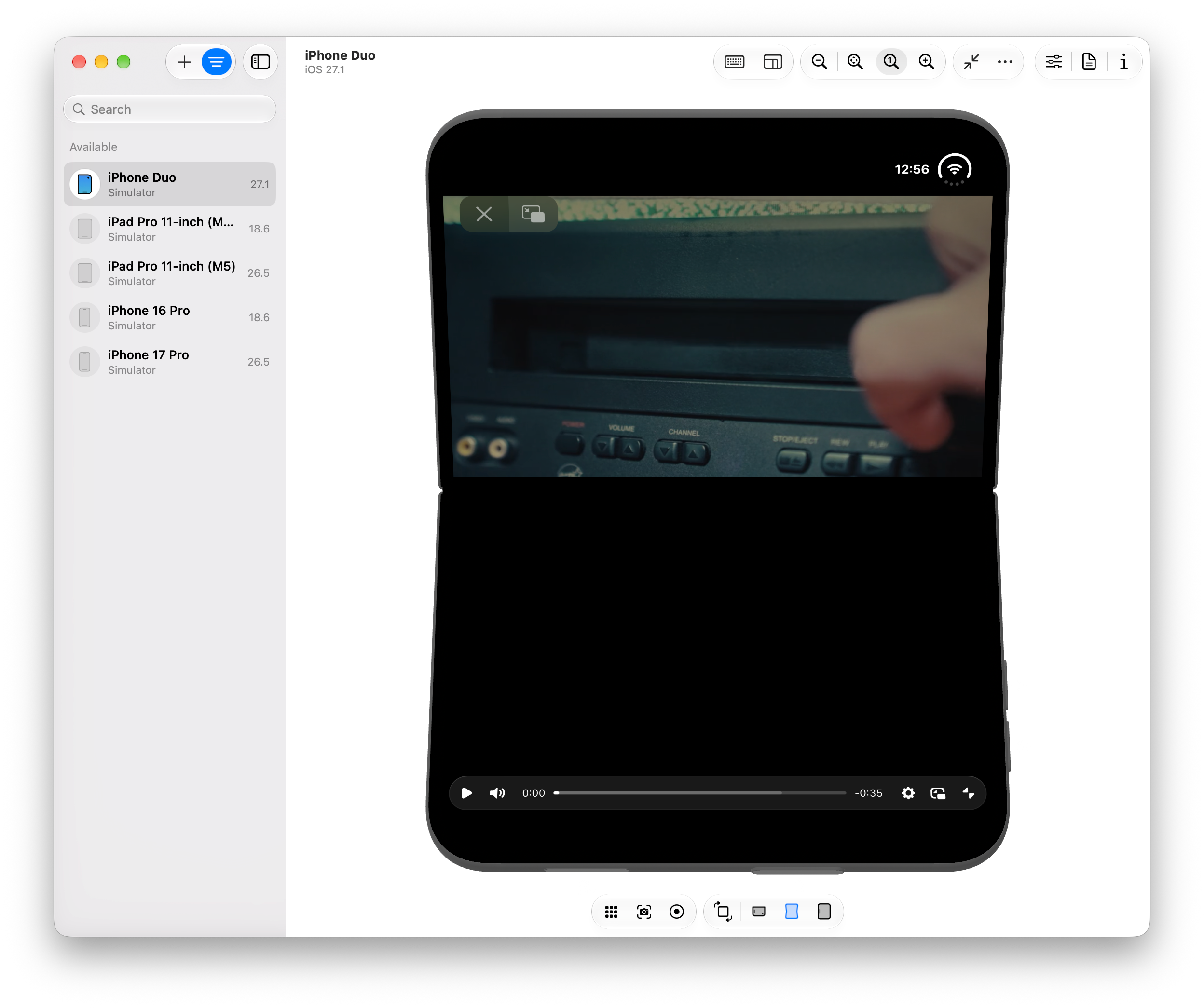
During exploratory testing within simulated developer environments utilizing beta software development kits, engineers found that combining the Fullscreen API with Viewport Segments and Device Posture queries allows for advanced layout manipulation. By overriding default media control containers and applying custom CSS grid configurations, developers can map video elements strictly to the top display segment while populating the lower segment with customized, application-specific playback tools.
Furthermore, advanced visual effects, such as ambient lighting modes that mirror video color data onto adjacent screen areas, can be achieved via HTML5 Canvas manipulation. By capturing active video frames using requestVideoFrameCallback(), scaling them down to a low-resolution rendering context, applying CSS scaling, heavy blurring, and gradient masks, developers can simulate dynamic background reflections that enhance the visual immersion of split-screen media consumption.
Cross-Platform Compatibility and Browser Engine Limitations
Despite the successful proof-of-concept implementations demonstrated in developer sandboxes, broader cross-platform deployment remains constrained by existing browser engine architectures. Testing across different browser environments—including simulated Chromium builds configured for foldable Android hardware—reveals divergent behaviors regarding full-screen content rendering.
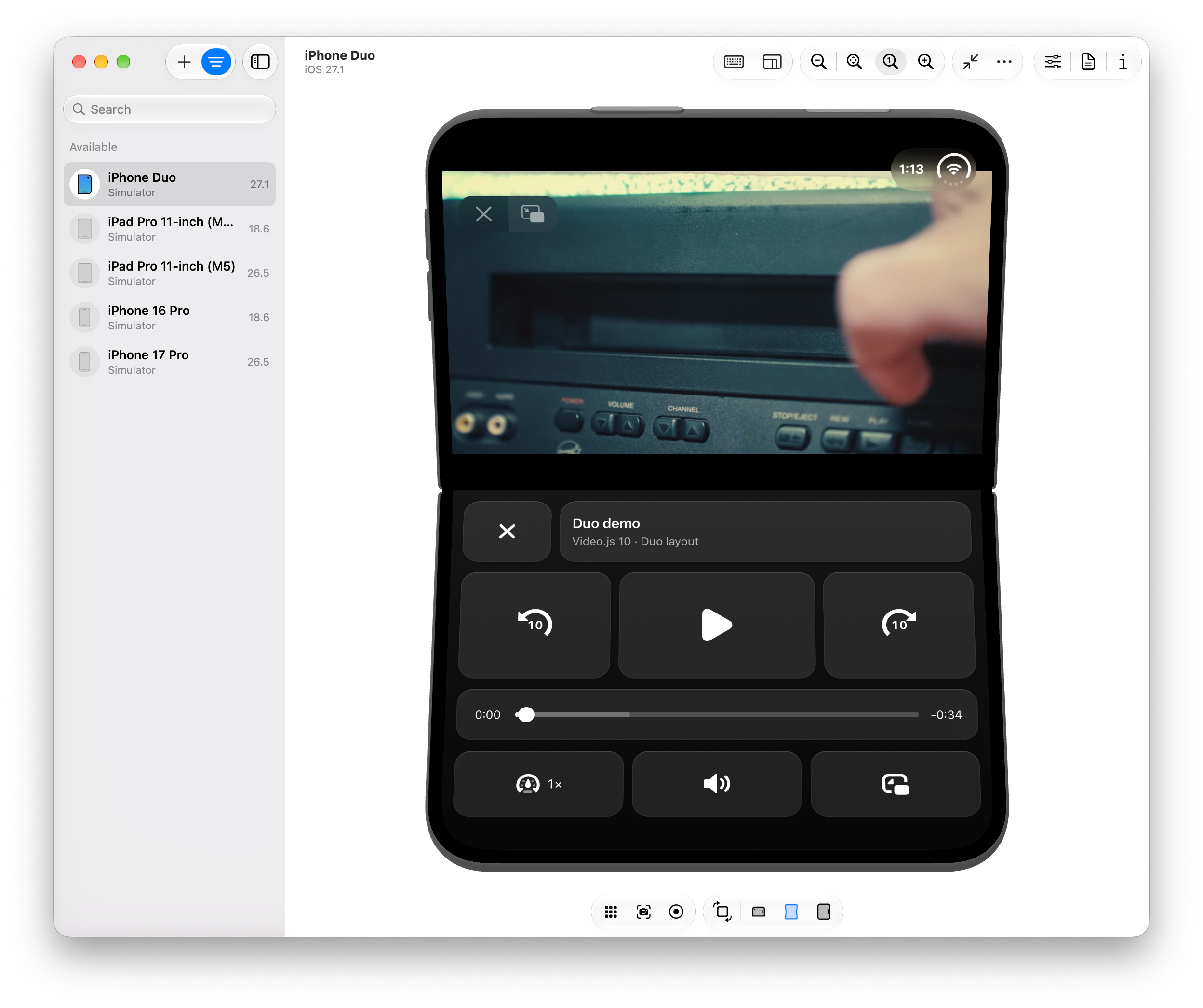
While CSS media queries accurately report device posture and viewport segments across multiple browser engines, rendering engines frequently restrict full-screen content to a single display segment for ergonomic and power-consumption reasons. Consequently, attempts to split interactive application components across a physical hinge in a standard browser full-screen mode often result in clipping on the opposing screen segment. These technical barriers indicate that fully realized split-screen web media experiences will require ongoing collaboration between browser vendors, standards organizations, and hardware manufacturers.
Broader Industry Implications and Future Outlook
The exploration of foldable web APIs highlights a maturing web ecosystem capable of adapting to radical shifts in consumer hardware. As modular and multi-screen devices gain commercial traction, the demand for fluid, responsive web architectures that transcend traditional flat rectangular constraints will only increase.
For frontend developers and open-source projects like Video.js, the introduction of composable architectures and standardized layout hooks provides the necessary tooling to experiment with novel user interfaces long before hardware achieves mass adoption. While native applications currently retain an advantage in deep hardware integration and specialized multi-screen optimization, the ongoing evolution of web standards ensures that the browser remains a viable platform for next-generation mobile experiences.