
Engineering the Flexible Future: How Video.js v10 Explores Web APIs for Foldable Mobile Devices

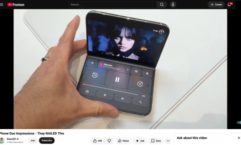
The recent release of version 10.0.0 of the prominent open-source media framework Video.js has sparked broader industry conversations regarding the integration of web applications with emerging hardware form factors. Following the deployment of software development kits and developer previews for dual-screen and foldable devices—exemplified by Apple’s developer ecosystem updates for hardware like the hypothetical iPhone Duo and existing Android foldables—web developers are increasingly tasked with adapting continuous media experiences to segmented viewports. This transition highlights a critical intersection between modern CSS architecture, experimental browser feature flags, and the evolving standards of mobile hardware interaction design.
Background and Context of Foldable Web Integration
Over the past half-decade, foldable smartphones have shifted from experimental prototypes to mainstream consumer products. Operating systems such as Android and iOS have progressively introduced native APIs to support multi-pane layouts, hinge awareness, and posture states. Historically, native applications have held a monopoly on leveraging these physical attributes, implementing specialized UI patterns such as table-top or "laptop mode," where media consumption is segregated to the top display panel while interactive controls and secondary content inhabit the lower half.
Web developers, however, have historically faced limitations when attempting to replicate these native-grade experiences. Browsers running on mobile operating systems frequently abstract hardware characteristics, restricting web apps to standard rectangular viewports regardless of underlying physical hinges or folds. The introduction of specific browser capabilities—namely the Device Posture API and the Viewport Segments API—aims to bridge this gap, granting web standards the ability to query physical display configurations and adapt layouts accordingly.
Technical Breakdown: Device Posture and Viewport Segments APIs
The integration of foldable display support into web browsers relies on two foundational W3C-proposed specifications currently being evaluated and implemented across various rendering engines:
- The Device Posture API: This interface provides web applications with real-time awareness of the physical state of the device. Through JavaScript (
navigator.devicePosture) or CSS media queries (@media (device-posture: folded)), developers can detect whether a display is continuous (flat or curved) or folded into specific angles, such as the laptop-like posture common in clamshell devices. - The Viewport Segments API: Complementing posture detection, this API details the exact geometric layout of segmented displays. JavaScript properties (
window.viewport.segments) return an array ofDOMRectobjects defining the coordinates, sizes, and locations of individual screen regions divided by a physical hinge. In CSS, developers utilize media features like@media (horizontal-viewport-segments: n)alongside environment variables (env(viewport-segment-width)) to precisely map grid items or flex containers to distinct display panels without spilling content across the unusable seam.
During recent developmental testing utilizing beta software development kits, engineers successfully mapped multi-column layouts and media components to these environmental variables, demonstrating that CSS grid systems can dynamically snap to physical boundaries when a device is partially folded.
Implementing Advanced UI Patterns: The Media Player Experiment
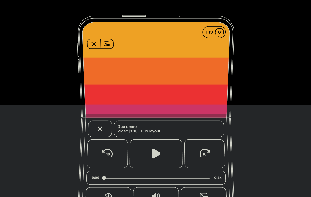
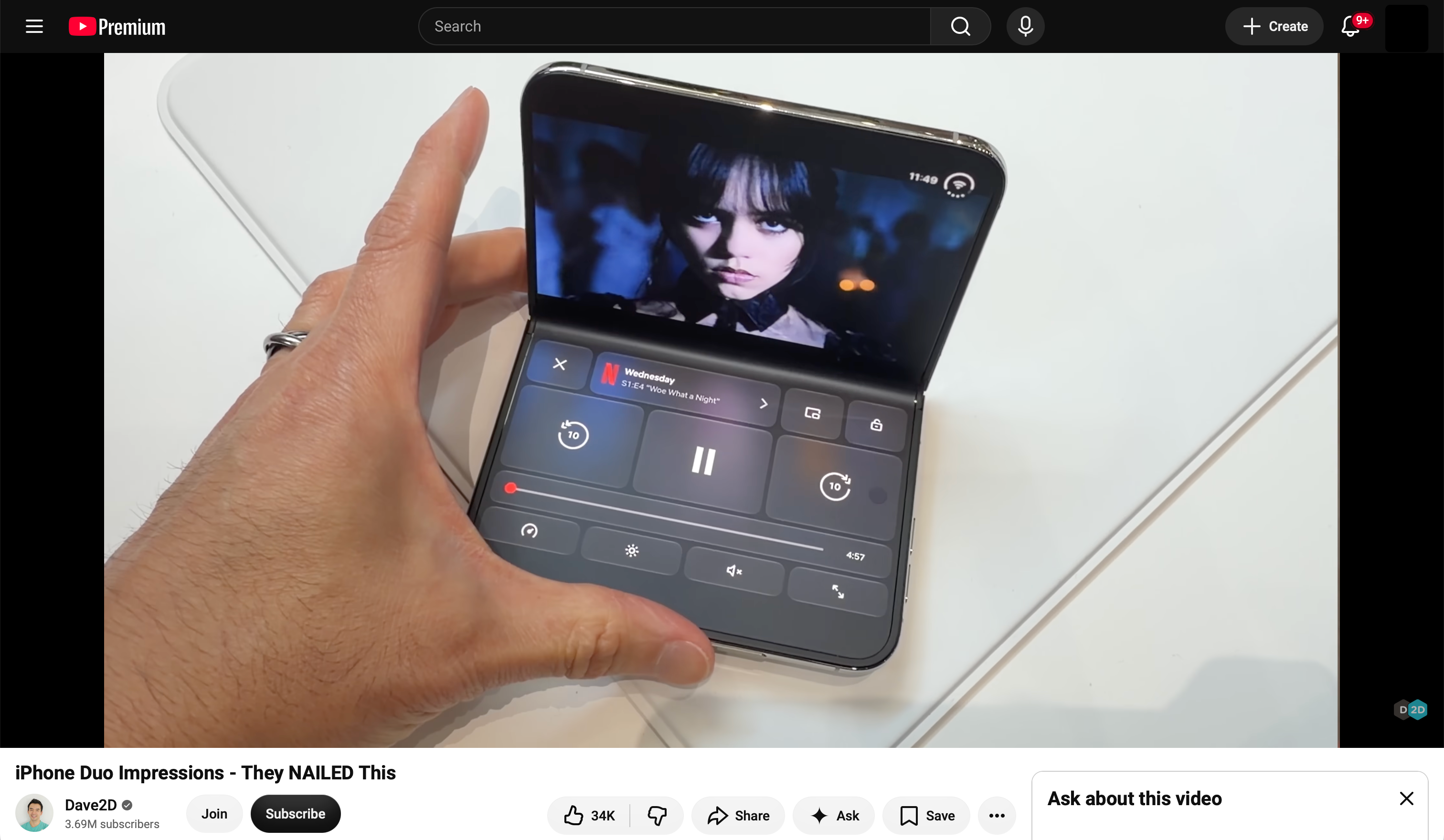
The practical application of these APIs was recently tested through an experimental adaptation of the newly released Video.js v10 architecture. Leveraging the framework’s modernized, composable component structure, developers investigated whether a web-based video player could mimic the split-screen paradigm popularized by native streaming applications like Netflix on foldable hardware.
In a fully folded, vertical posture configuration, the objective was twofold: position the primary video element exclusively within the upper display segment while relocating playback controls, time sliders, and contextual metadata to the lower display segment. Furthermore, experimental efforts sought to recreate ambient lighting effects—mirroring YouTube’s ambient mode or cinematic reflections—by capturing video frames via an off-screen canvas element, applying CSS scaling, heavy blurring, and gradient masking behind the control interface.
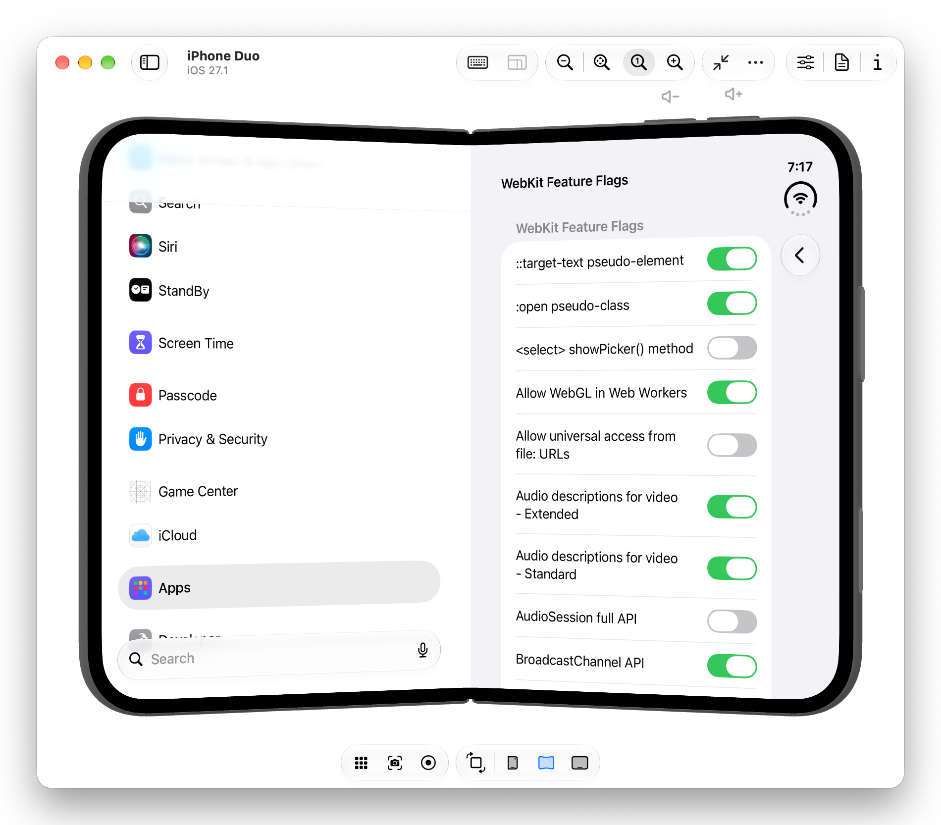
While the layout implementation proved feasible via custom CSS stylesheets and targeted DOM manipulation, the experiment encountered significant platform-level constraints. Standard mobile browser implementations often restrict HTML5 video elements from utilizing custom full-screen APIs across segmented viewports without forcing native, OS-controlled full-screen behaviors. When evaluated across different rendering engines—including experimental Chromium builds on foldable Android emulators—full-screen content was systematically clipped or restricted to a single display segment due to intentional upstream security and UX constraints implemented by browser vendors.
Industry Implications and Browser Vendor Limitations
The findings from these developer experiments underscore a persistent tension between web capability and native operating system design. Despite the standardization of APIs designed to report device geometry, actual deployment of rich web experiences on foldable hardware remains bottlenecked by browser security models and platform-level restrictions surrounding full-screen management.
- Ergonomic and Power Constraints: Operating system vendors exercise strict control over hardware states like continuous full-screen rendering on multi-pane displays due to battery consumption and thermal management concerns associated with driving distinct display driver integrated circuits simultaneously.
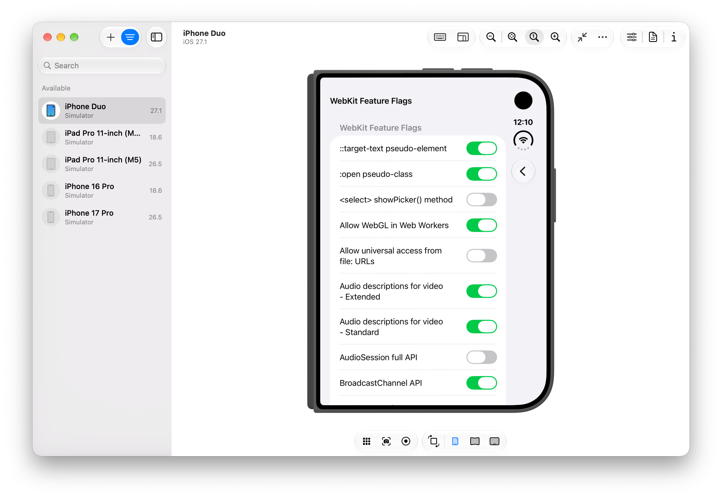
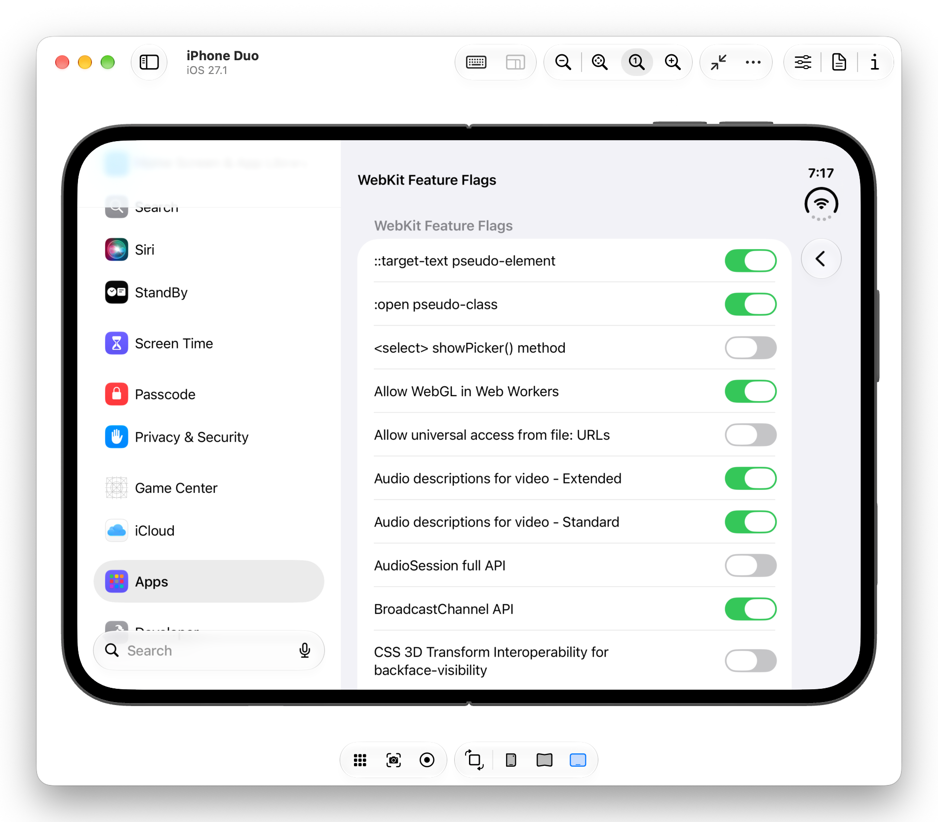
- Standardization Gaps: While Chromium-based environments and WebKit variants show varying degrees of support for experimental feature flags involving posture and viewport segmentation, universal consensus on how web elements should behave across a physical hinge has not been finalized by standards bodies.
- The Rise of Composable Frameworks: Despite these hurdles, updates like Video.js v10 demonstrate that modern component-driven architectures provide the necessary flexibility for developers to prototype advanced interface paradigms rapidly. Even if platform limitations temporarily restrict deployment, the ability to declaratively style web components using emerging layout variables prepares the developer ecosystem for eventual native parity.
As hardware manufacturers continue to refine foldable form factors and operating system vendors expand developer access, the pressure on browser engines to support sophisticated viewport APIs will intensify. For the web development community, tools that embrace modular design patterns will remain essential in bridging the gap between static web documents and dynamic, multi-screen hardware environments.
Related posts: