
The Evolution of Analytics Reporting
For years, the primary complaint among power users of Google Analytics has been the friction involved in cross-referencing data. Traditionally, marketers were forced to toggle between numerous individual reports, exports, or third-party visualization tools like Looker Studio to get a holistic view of campaign performance. While Google Analytics 4 (GA4) introduced significant improvements in event-based tracking and predictive metrics, the user interface remained relatively siloed.
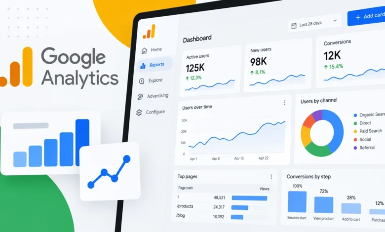
The introduction of Dashboards addresses this by providing a centralized workspace where dimensions and metrics can be dragged and dropped onto a canvas. This grid-based system allows users to resize, position, and align charts manually, offering a level of design freedom previously absent from the native interface. By enabling users to publish these boards directly to the left-hand navigation bar, Google has effectively removed the bottleneck of the standard GA library, ensuring that critical KPIs are always a single click away.
Technical Specifications and Capabilities
At launch, the new Dashboard functionality supports six distinct visualization types, each designed to serve a specific analytical purpose:
- Scorecards: These provide immediate, high-level visibility into key performance indicators (KPIs), complete with percentage change indicators when date ranges are compared.
- Tables: Ideal for granular data analysis, these allow for detailed rows and columns, similar to standard GA4 reporting.
- Line Charts: Essential for monitoring trends over daily, weekly, or monthly intervals.
- Bar Charts: Designed for direct comparisons between different segments or sources.
- Donut Charts: Used for visualizing breakdowns, such as traffic sources or device categories.
- Funnel Charts: A critical addition for monitoring user journeys, specifically for tracking conversion steps and identifying drop-off points in the sales funnel.
These visualizations are subject to specific capacity constraints. Standard Google Analytics properties are limited to 15 cards per dashboard, while premium properties—typically those utilized by enterprise-level clients—are granted a capacity of up to 30 cards. These dashboards are managed at the property level; once published, they are accessible to all users who have access to that property, provided they have the necessary permissions.

Roles, Permissions, and Governance
Google has maintained a strict hierarchy for dashboard management to ensure data integrity. Only users assigned the "Editor" or "Administrator" roles have the authority to create and publish new dashboards. This is a deliberate choice intended to prevent the proliferation of redundant or inaccurate reports within a shared team workspace. Once a dashboard is published, it becomes a shared asset for the entire organization rather than a private, user-specific view. This creates a "single source of truth" for teams, reducing the risk of conflicting data interpretations across departments.
However, the current iteration of this feature does come with limitations. As of the initial release, the platform does not yet support API integration for these dashboards, nor does it allow for advanced segments or card-level comparisons beyond basic date-range toggling. Organizations requiring highly complex, cross-platform data blending may still need to rely on external tools like Looker Studio or BigQuery for more sophisticated BI needs.
Strategic Implications for Marketing Teams
The primary value proposition for this launch is the reduction of "context switching." Research consistently indicates that marketing teams lose significant productivity when jumping between disparate reporting tools. By consolidating reporting inside the GA4 interface, Google is attempting to minimize the time spent on administrative data gathering, allowing analysts to spend more time on strategic decision-making.
For example, a performance marketing team tracking a multi-channel campaign can now place a conversion rate scorecard, a traffic-source bar chart, and a checkout-process funnel chart side-by-side. This allows for real-time identification of performance dips. If the conversion funnel shows a sharp decline at the "Add to Cart" stage, the marketer can immediately pivot their attention to that specific metric without navigating through the standard library of secondary reports.
Context and Industry Competition
The timing of this release is critical. As privacy regulations continue to tighten and data collection becomes more complex, businesses are increasingly reliant on first-party data captured within their analytics platforms. Competitors in the marketing analytics space, such as Adobe Analytics and various SaaS-based dashboarding platforms, have long offered customizable workspaces. Google’s move to modernize the GA4 interface is a direct response to the demand for a more intuitive, "all-in-one" experience.

Furthermore, the integration of these dashboards into the core GA4 navigation signals Google’s long-term commitment to the platform. Since the forced transition from Universal Analytics to GA4, user sentiment has been mixed, with many critics citing a steep learning curve. The introduction of drag-and-drop dashboards is a clear effort to bridge the usability gap and make the platform more accessible to stakeholders who may not be data scientists but require clear, visual performance data.
Future Outlook and Limitations
While this release significantly enhances the usability of GA4, industry analysts suggest that the feature is likely to evolve. The absence of API support is currently the most significant hurdle for enterprise-level adoption, as many large companies rely on automated dashboard updates for executive reporting. However, given Google’s historical development cycle, it is reasonable to expect that API connectivity, enhanced filtering, and deeper segment integration will be prioritized in upcoming updates.
For the immediate future, businesses should view this launch as a "performance optimization" tool. It is not intended to replace the heavy-duty data warehousing capabilities of BigQuery, but rather to serve as an agile monitoring solution for daily and weekly performance tracking.
Best Practices for Implementation
Organizations looking to adopt these dashboards should implement a standardized naming convention and clear governance rules. Because published dashboards are visible to all users of a property, a cluttered navigation menu could quickly lead to confusion. Marketing managers should:
- Define Primary KPIs: Before building, identify the top 15 metrics that truly impact business growth.
- Establish Audience-Specific Views: Create different dashboards for different stakeholders (e.g., a "CMO View" focusing on revenue and ROI, and a "Campaign Manager View" focusing on CPC and CTR).
- Regular Maintenance: Audit dashboards periodically to ensure that the data being surfaced is still relevant and that the reports are being utilized.
Conclusion
Google Analytics Dashboards represent a maturation of the GA4 platform. By shifting from a static, rigid reporting model to a dynamic, customizable workspace, Google is providing the tools necessary for modern, data-driven teams to work more efficiently. While the feature currently has constraints regarding capacity and advanced integrations, it addresses a fundamental need for consolidated, easy-to-read performance reporting. For businesses currently struggling with fragmented reporting workflows, this update offers a clear path toward better visibility and more informed decision-making, directly within the environment where their data lives.