
Exploring the Web API Landscape of Foldable Smartphones Through the Lens of Video.js 10

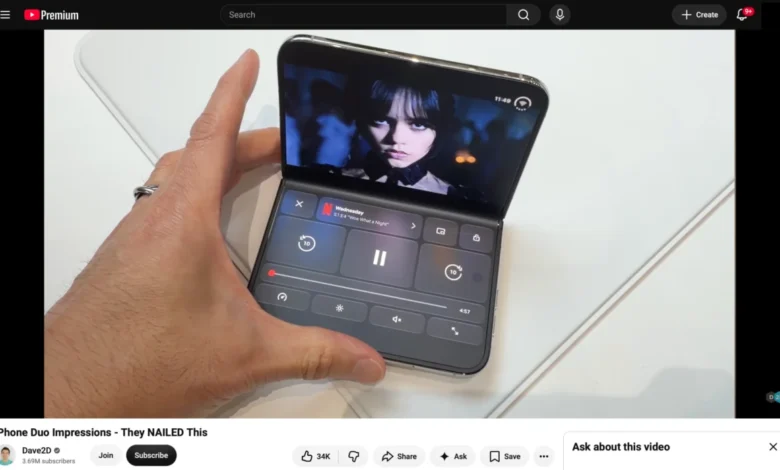
The recent release of Video.js 10.0.0 marks a significant milestone for web-based media delivery, introducing a modular, composable architecture designed to adapt to modern form factors. Following this rollout, development teams have begun experimenting with emerging hardware capabilities, specifically foldable mobile devices. While foldable smartphones have maintained a presence in the Android ecosystem for several years, recent hardware developments in the iOS ecosystem have prompted web standards organizations and browser vendors to re-evaluate how modern web APIs interact with multi-screen and dual-viewport architectures.
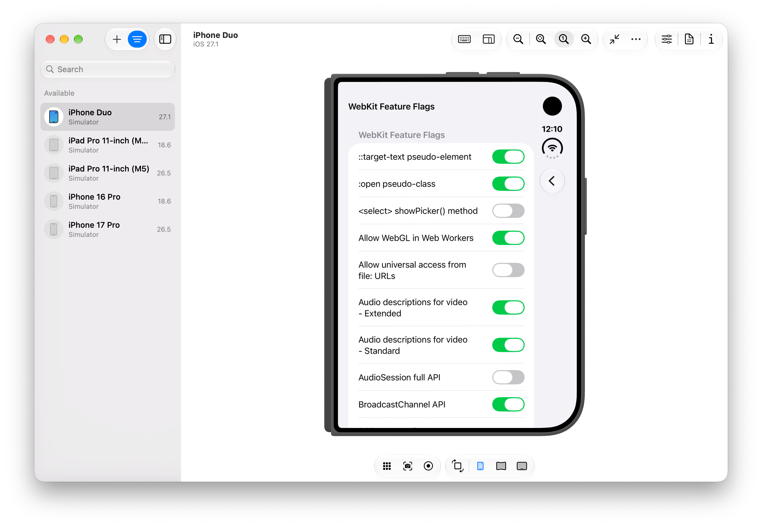
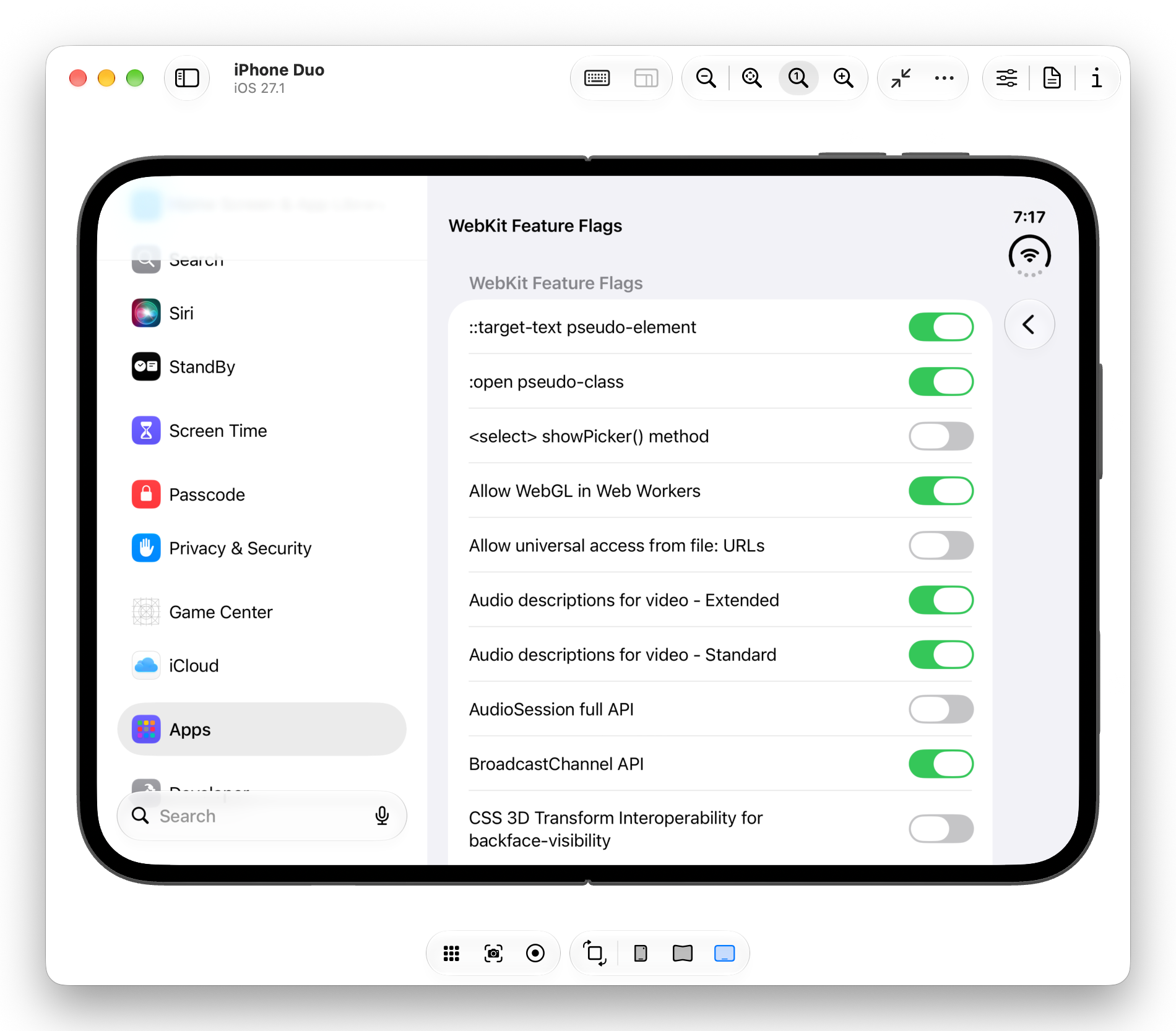
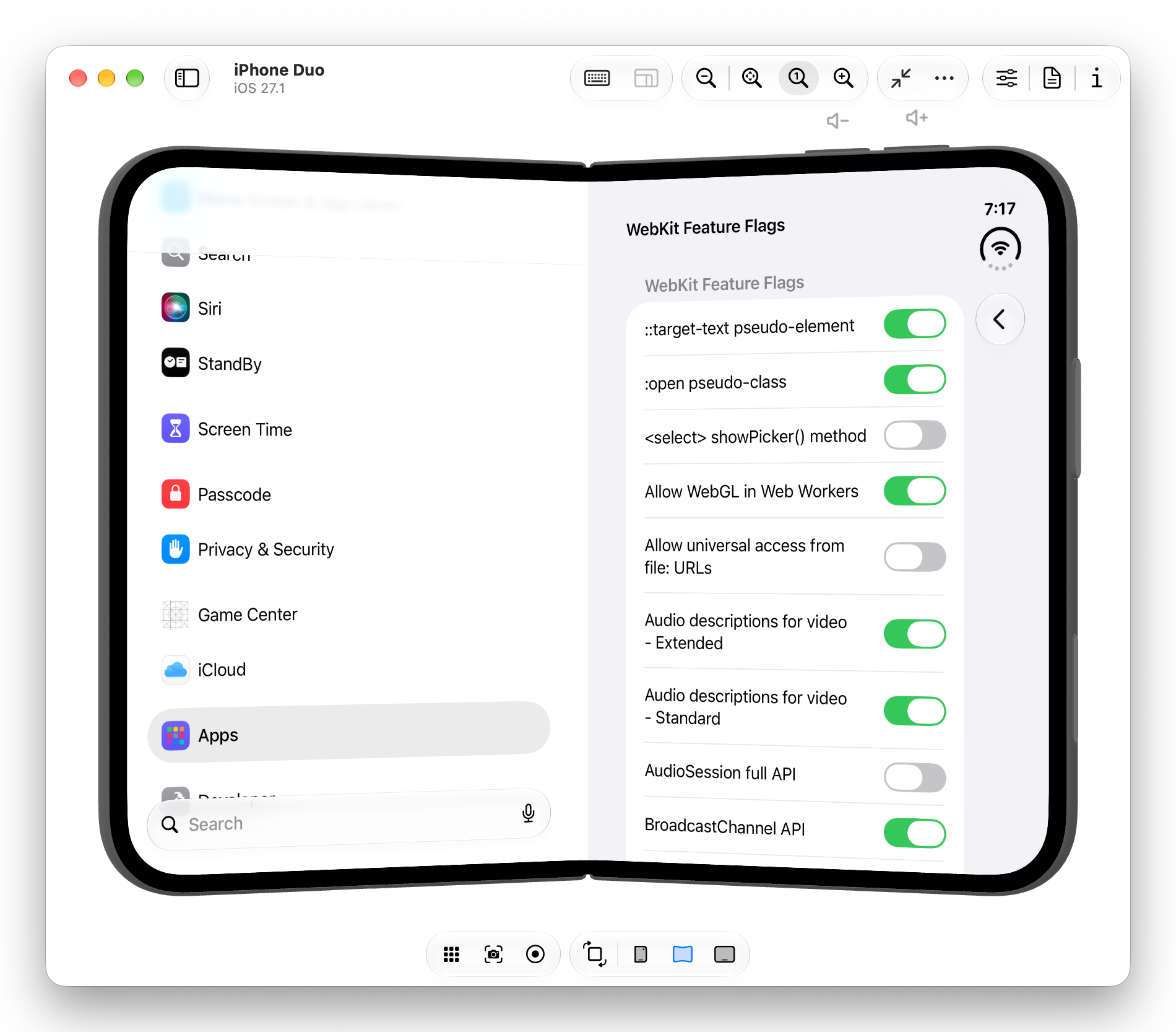
The introduction of simulated development environments for folding iOS hardware via specialized device hubs has provided developers with early access to upcoming WebKit feature flags. Among the most notable additions are the Device Posture API and the Viewport Segments API. These interfaces grant web applications programmatic insight into the physical configuration of hardware, allowing developers to optimize layouts for devices that transition between flat, continuous displays and folded laptop-style configurations. Despite these advancements, significant technical and platform-specific limitations continue to challenge developers attempting to deliver native-like media experiences across diverse mobile operating systems.
Understanding the Device Posture and Viewport Segments APIs
The modern web development landscape is increasingly influenced by unconventional screen geometries, requiring layout engines to respond dynamically to hardware constraints. Two primary specifications currently lead this adaptation process: the Device Posture API and the Viewport Segments API.
The Device Posture API provides developers with real-time data regarding the physical state of a device. Through JavaScript via the navigator.devicePosture property or via CSS media queries such @media (device-posture: folded), web applications can determine whether a display surface is continuous or divided by a hinge mechanism. This distinction is critical for applications that need to alter their user interface based on whether the device is held flat or propped open at an angle.
Complementing posture detection, the Viewport Segments API provides detailed geometric data regarding the individual display regions created by a physical fold. In JavaScript, window.viewport.segments returns an array of DOMRect objects detailing the dimensions and coordinates of each screen segment. In CSS, developers utilize @media (horizontal-viewport-segments: n) and @media (vertical-viewport-segments: n) alongside CSS environment variables—such as env(viewport-segment-width) and env(viewport-segment-left)—to construct responsive grid layouts. By harnessing these variables, developers can prevent critical UI components from rendering directly over the physical crease of a foldable device, ensuring structural integrity and visual clarity.
Prototyping Media Interfaces for Foldable Viewports
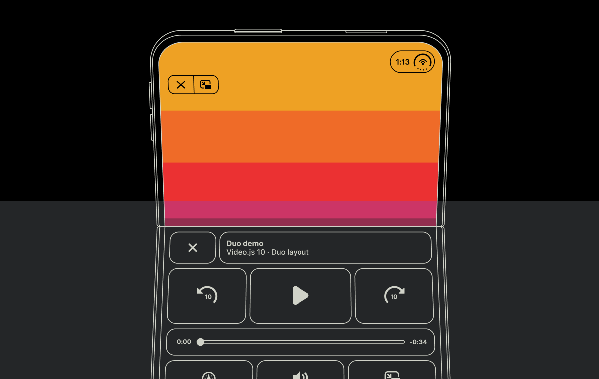
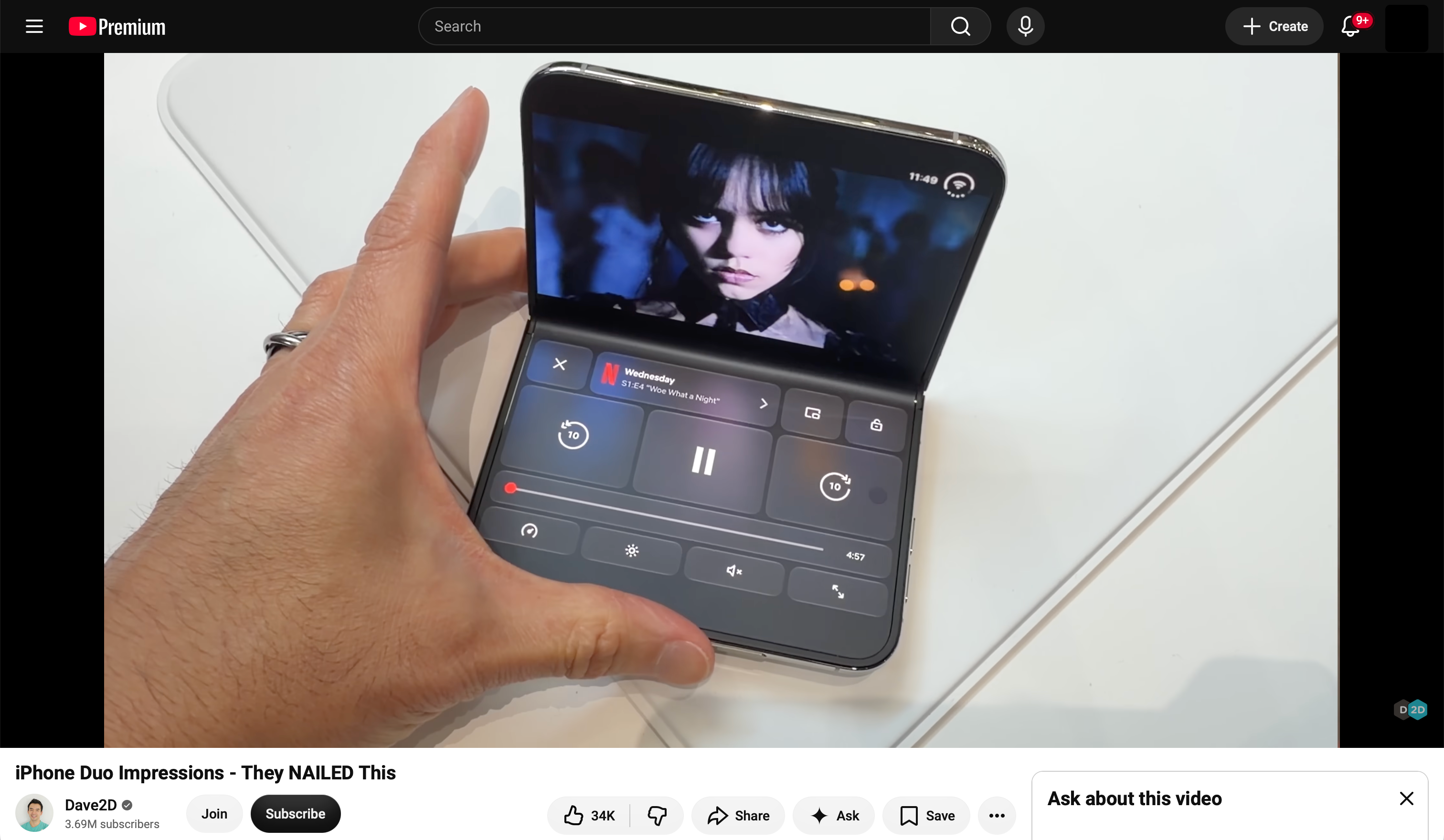
The architectural flexibility of Video.js 10 enables developers to decouple media controls from standard rendering containers, opening new possibilities for custom layout configurations. Inspired by native applications—such as video streaming clients that place primary video playback on the upper screen and interactive controls on the lower screen during folded operation—developers have explored replicating these paradigms within standard browser environments.
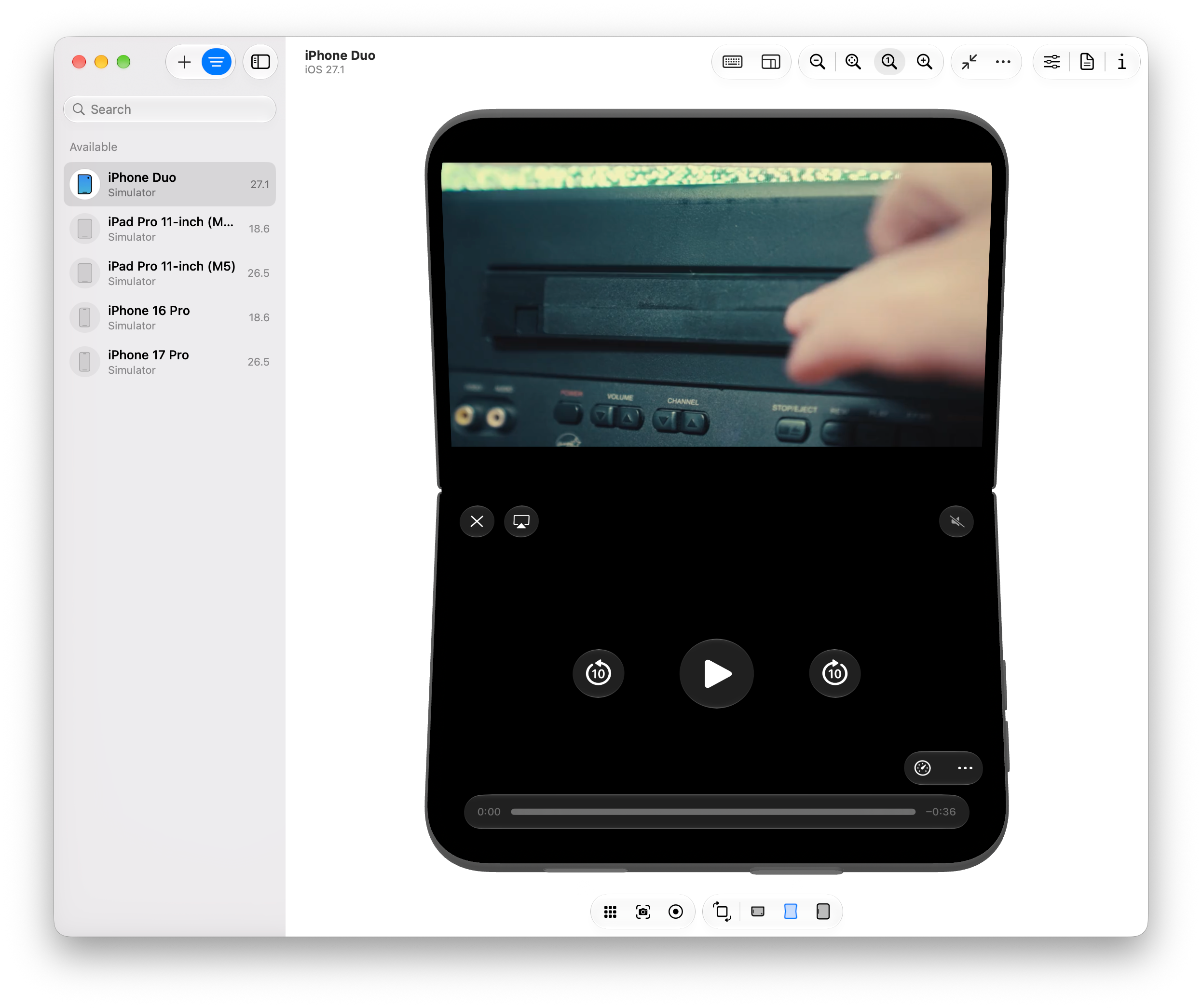
To achieve a segmented media layout, developers must define custom markup structures that target specific viewport segments when a device enters a folded posture. For instance, configuring a grid layout to position the primary video element within the upper display segment while redirecting transport controls and metadata displays to the lower segment requires precise CSS calculations.
Furthermore, advanced visual effects, such as ambient lighting or mirrored reflections, can be implemented to enhance the aesthetic quality of folded media players. By capturing video frames via a hidden canvas element, applying CSS filters such as blur and vertical scaling, and utilizing gradient masks to fade the reflection near the hinge, developers can simulate ambient lighting effects reminiscent of native desktop and mobile streaming applications.
Platform Constraints and Browser Implementation Challenges
Despite the technical feasibility of authoring custom CSS and JavaScript layouts for foldable devices, real-world deployment faces substantial hurdles related to browser security models, window management policies, and platform-specific restrictions.
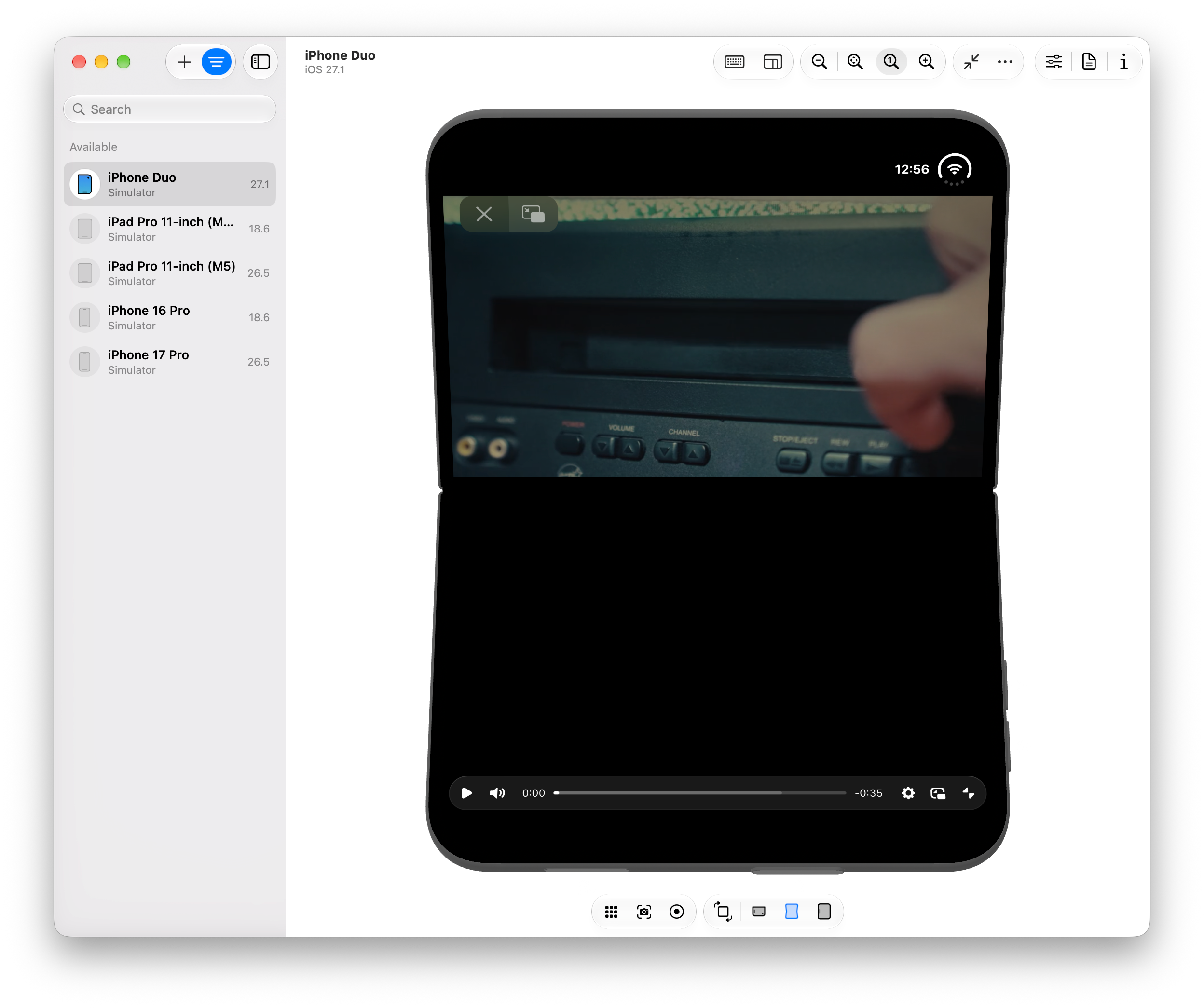
Historically, mobile operating systems maintain strict controls over fullscreen API implementations to optimize power consumption, maintain ergonomic standards, and prevent unauthorized UI overlays. Within iOS environments, web applications running inside standard browser tabs frequently encounter limitations regarding element positioning in fullscreen mode, often defaulting to native system-level controls rather than rendering custom web component toolbars across split screens.
Cross-platform testing reveals varying degrees of support across browser engines. While Chromium-based environments on Android devices correctly report posture and segment metrics through CSS media queries, internal window management and rendering pipelines often restrict fullscreen video rendering exclusively to the primary screen segment, intentionally clipping or disabling content on secondary display regions to preserve stability and user experience guidelines. Consequently, advanced multi-screen web video layouts remain heavily dependent on experimental feature flags and ongoing specification updates within the W3C and WHATWG standards groups.
Broader Implications for the Web Development Ecosystem
The exploration of foldable hardware through frameworks like Video.js highlights a broader transition in web development toward hardware-agnostic design systems. As device manufacturers continue to experiment with dual-screen, rollable, and foldable form factors, the traditional assumption of a single, continuous rectangular viewport is increasingly obsolete.
The adoption of APIs designed for physical hardware states signals a maturing web platform capable of competing more closely with native application frameworks. However, the divergence between browser vendor implementations underscores the ongoing tension between open web standards and proprietary platform constraints. Standardizing APIs such as Device Posture and Viewport Segments is a necessary step, but the ultimate success of rich web applications on emerging hardware will depend heavily on unified browser support for advanced presentation modes, fullscreen controls, and secure surface composition.
Ultimately, while sophisticated multi-segment media players remain largely experimental, the tools required to build them are rapidly evolving. The intersection of modern media frameworks and hardware-aware CSS primitives demonstrates that the web ecosystem is actively preparing for the next generation of computing devices, even as platform gatekeepers navigate the complexities of user experience and system security.